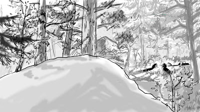
It might make more sense if you move them down because it looks a little like the ground plane is slanting upward. Also, their camp placement is pretty close to Tonto. That's kinda picky though. I tested with this:
Otherwise, I think your layout would totally work for our painters. :)


Looks really awesome. Also I like Kim's adjustment, I think it works better to have them slightly farther off in the distance.
ReplyDeleteok. that's fine with me.
ReplyDelete